placards
A while back I thought it’d be fun to have gallery-style placards for the art around our house. I put together an early version of this little script, printed out a few, and taped them up to see how I felt about them.
Now, months years later, it was high time I actually finished the project.
What was left? Not a lot. The end goal was to have physical placards, so there was clearly work to be done there. But the rest of the pipeline, art data → software → printable pages, was ready and waiting.
I’m pleased to find that my initial designs still feel clean and fresh. My design projects often stay unfinished because I’m not sure how to make them feel whole and cohesive. To be fair, there’s not a lot of elements to cohere in this project. But I’m really proud of how things look, especially seeing multiple placards in the same space. They’re interesting without being intrusive.
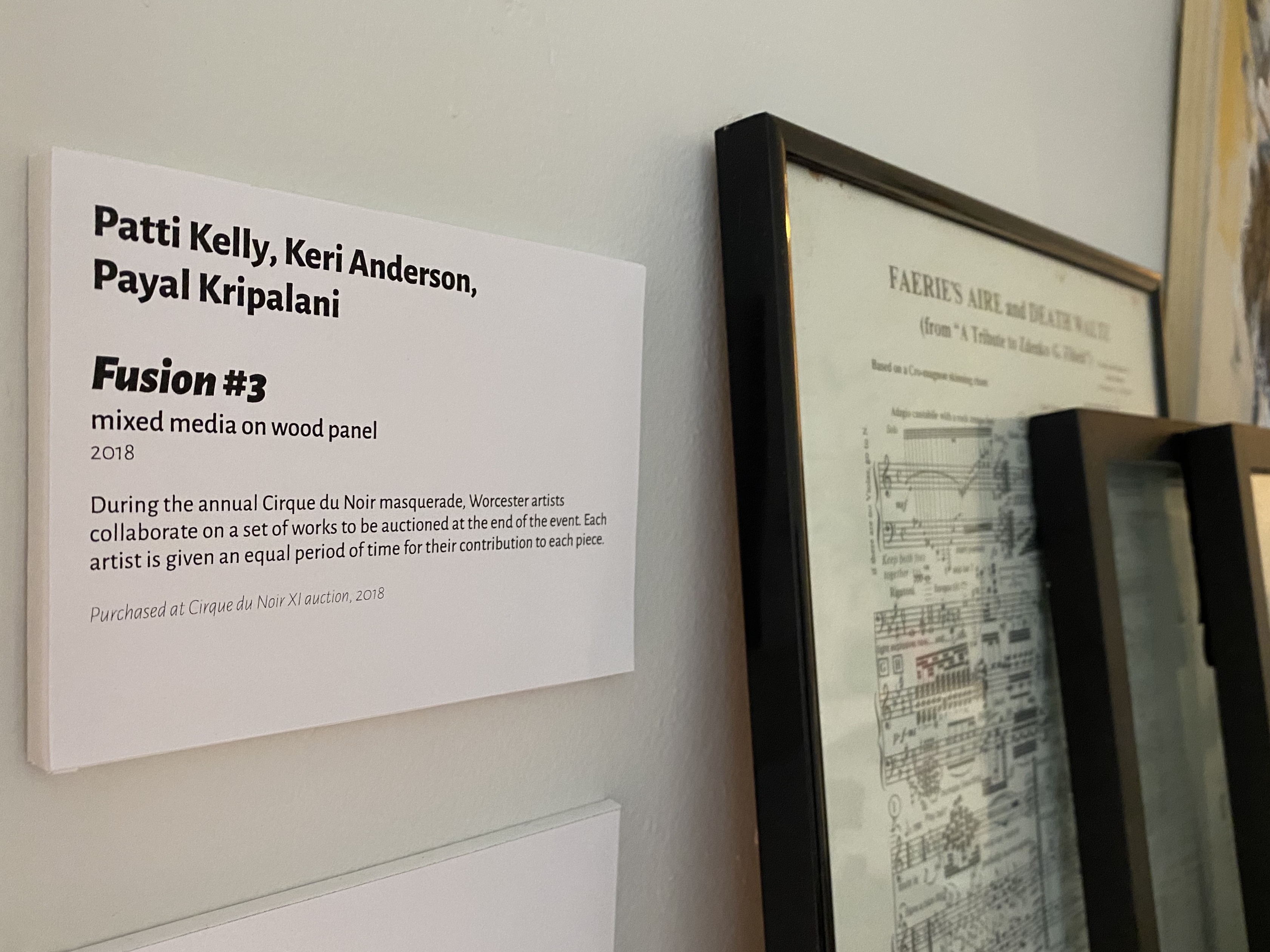
The type is set in Juan Pablo del Peral’s Alegreya Sans family, which gets more vibrant and calligraphic in its heavier weights but still reads beautifully for body text. (And just look at that thin italic!) I wanted something that would make the placards familiar at a glance — “those look like the things in museums!” — but weren’t so “realistic” that they became bland. This is “our museum”, not a replica of some quintessential museum, and I want it to feel special and exciting.
The software itself isn’t much to speak of, though I’m glad it’s stayed simple: some Python gluing together some HTML templating, some CLI argument parsing, and some Markdown rendering. The schema for art data hasn’t changed much over time, beyond supporting a title and Markdown formatting for the description/note. As a personal tool, this should be sufficient for a long while. (If anyone else winds up using it, PRs and comments are more than welcome!)
There’s a lesson here. Yes, there was value in doing a prototype and seeing how it evolved. I discovered some more data I wanted to track, and some more capabilities I wanted in the software. And I know there were a few early design revisions not captured in the project’s git history. But overall, I needed a lot less time to “wait and see”, or to edit, than I gave myself. This project could have been done a long time ago! My instinct to wait is powerful but often wrong.
Constructing the placards ended up being perhaps the most satisfying part of the whole project. They’re made from foam board, cut to size,✻ with the edges wrapped in this wonderful stuff — Post-It’s “correction and cover-up tape”. I discovered it last year, and I’ve used it for labeling shelves and boxes, mostly, but it made a great addition to this paper-centric construction. The printed text is attached with a thin roll-on adhesive, and the placards are mounted to the wall with some artist’s masking tape.
This project scratched a number of itches for me. It’s a cohesive design, both the typography in particular and the objects in general. It’s a piece of software that does one thing reasonably well, built for this particular need. It’s a tiny bit of infrastructure that makes it easier to expand the collection, or to revamp the whole design in the future. It’s a set of physical objects in the real world that I got to construct with care. And it’s an opportunity to make our living space more beautiful; something I’ll notice every day.
Plus, it’s momentum towards finishing other projects. Onward!
✻ Partway through the first stage of construction, cutting out the foam board, I rediscovered that the placards have a minimum size, not a fixed size. Whoops!